Features
Features encode user preferences, inherit behavior(s) and are communicated by several principals through agents.
Ambience Features
In the physical world, we use lights (amongst other things) to control the ambience of our homes. Houses build decades ago only contained necessary power cables within walls to save costs. Nowadays a wire plan includes network and many more switches and plugs. Plus we have wireless connection to "patch" connectivity in our homes to non-wired locations.
Three eras of architectural constraints that lead to different ambient experiences. Decades ago one light source at the ceiling in the middle of the room with one switch next to the door was the ambience experience. Today we have lots of inter-connected devices and switches that play music and use the rhythm to control lights by keeping them in a synchronized motion.
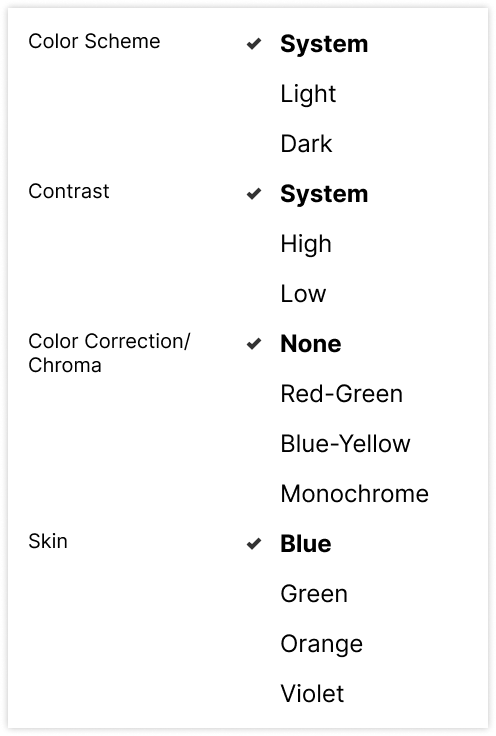
Design tokens share a similar history when it comes to creating an ambient experience for customers. From no themes at all to themes with the possibility of these features:
- Color Schemes (light/dark/system)
- Color Contrast (high/low/system)
- Color Correction / Chroma
- Skin
Imagine a customer can control their preference with these options:

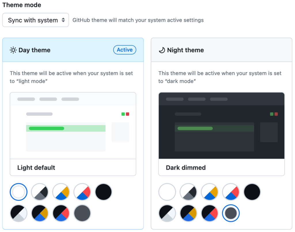
Color Schemes
Color schemes were intensively explained for the behaviors. What's left here is an explanation why we call it dark mode today? It is no longer a mode but we keep continue carry on the name... and I have a desire to call things properly, my inner monk is heavily triggered by this. Why do we still call it that way?
History can help here: When the first services offered dark color schemes, they were referred to as dark mode - for which I have two reasons, why it was called mode.
- When this change is made in the OS, the mode for the whole system is changed - where mode makes sense - and the term was carried over.
- Media query didn’t exist back in the day and implementers had to choose for the mode.
For me dark mode is the marketing term of what we call color schemes. When speaking about implementation we must be clear whether we speak about mode or adaptive option.
| Color Scheme Feature | |
|---|---|
| Behavior | mode / adaptive |
| Agent | Product, Tech Platform, OS |
| Principal | Product, User |
| Defaults | Platform Vendor, OS Vendor |
Color Contrast
For color contrast the same mechanics are available as for color schemes. Unlike color schemes, there is no strong marketing term behind to give this feature a mandate for implementation.
| Color Contrast Feature | |
|---|---|
| Behavior | mode / adaptive |
| Agent | Product, Tech Platform, OS |
| Principal | Product, User |
| Defaults | Platform Vendor, OS Vendor |
Color Correction / Chroma
Supporting visually impaired people with different chromatic versions of your design in order to give them a chance to visually distinct information is slowly getting traction. The first services are spotted to provide this customization to their customers.

Unfortunately this is not available as an adaptive option. There is no dedicated CSS media query to it, it needs to be provided as mode.
| Color Correction / Chroma Feature | |
|---|---|
| Behavior | mode |
| Agent | Product, OS |
| Principal | Product, User |
| Defaults | Product, OS |
Note: Some OS may have the functionality to tint the UI within the entire OS. This step happens towards the end of the graphics pipeline before pixels are drawn on the screen, therefore out of scope for us.
Skin
Sometimes I pretend to play a video game instead of working, at least it helps to explain things here and there. Think about a video game in which you create your avatar/character you are playing. They offer character customizations for various aspects, often you can choose different colors for eye, hair or skin. This explains where I borrowed the name from, how does this look in the wild?
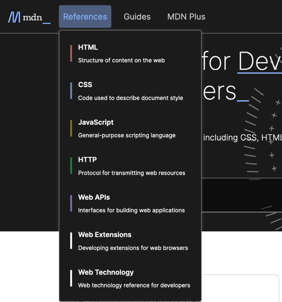
This is seen when a certain product like to color multiple areas, such as the section of a news magazine. A good example is Mozilla's MDN in which they color coded the covered technologies.

The area of effect for the skin mechanic can differ. From highlights and cues to entire ambience including surfaces; choice is in the hands and creativity of designers. Products may provide this customization options to their users as an aesthetic preference or a product itself sets the context for a particular skin.
| Skin Feature | |
|---|---|
| Behavior | mode |
| Agent | Product |
| Principal | Product, User |
| Defaults | Product |
Note: "Skin" is a representative for all product specific features. When designing for cultural differences, an important feature is locale to give different designs for certain countries or for a more playful product a feature may be device orientation and different look and feel depending how you hold your device.
Animation
Moving things around can be helpful, explaining, entertaining and joyful, but for some people it can cause health problems. We'd be wise to have a token that controls this.
Motion
For preferred motion, the same mechanics are available as for color schemes and contrast.
| Motion Feature | |
|---|---|
| Behavior | mode / adaptive |
| Agent | Product, Tech Platform, OS |
| Principal | User, Product |
| Defaults | Platform Vendor, OS Vendor |
Sizing
Sizing addresses either font sizes, spatial design and layout dimensions or all of them; it depends on your product.
Font Size
Default font-size is a customer setting, either set in the operating system or in the technical platform (eg. browser). The default behavior of the product shall be to respect that setting. As products may implement this preference differently, there is a chance this diverges from a customer's default. In such a situation, your product may want to provide sizing options to users.
Respecting user preference and providing options, works with minimal effort, and targets one design token - that propagates this behavior throughout the system.
Here is sample CSS code:
/* Sizing options */
:root {
  --sizing-factor: 1; /* default case */
}

[data-sizing="smaller"] {
  --sizing-factor: 0.8;
}

[data-sizing="bigger"] {
  --sizing-factor: 1.2;
}

/* Sizing */
:root {
  font-size: calc(0.5vw + 1em * var(--sizing-factor));

  /* sizing one step below s0 */
  --s-1: calc(var(--s0) * pow(var(--sizing-factor), -1));

  /* sizing level 0, matching user preference */
  --s0: 1em;

  /* sizing one step above s0 */
  --s1: calc(var(--s0) * pow(var(--sizing-factor), 1));
}
Now let everything in your design be based on this root value and you have a design that respects users preference and is responsive. Use relative lengths over absolute lengths for propagation through your system.
| Sizing Feature | |
|---|---|
| Behavior | mode / (responsive) |
| Agent | Product, Tech Platform |
| Principal | User, Product |
| Defaults | Platform Vendor |
INFO
Preferential mobile operating system settings and browsers settings may be intertwined and be the same.
Density
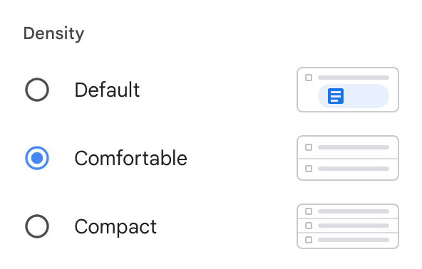
Remember in gmail, the preferences to change the density of the product?

Density addresses layout and influences the base value for spacing. Spacing mostly applies to padding and gap. Designers choose which available spacing to apply at a certain element and may choose between given values. To clarify these words:
Spacing: Designers use and apply spacing
Density: User-preference that modifies spacing
Bonus points to connect it to font-size, to have everything controllable through one value, here is a sample:
/* density */
:root {
  --density: 1;
}

[data-density="compact"] {
  --density: 0.8;
}

[data-density="relaxed"] {
  --density: 1.2;
}

/* spacing tokens */
:root {
  /* spacing one step below spacing0 */
  --spacing-1: calc(var(--s-1) * var(--density));

  /* base spacing, refering to user preference */
  --spacing0: calc(var(--s0) * var(--density));

  /* spacing one step above spacing0 */
  --spacing1: calc(var(--s1) * var(--density));
}| Density | |
|---|---|
| Behavior | mode |
| Agent | Product, OS |
| Principal | Product, User |
| Defaults | Product, OS |