Theming
Theming in Design Systems is a de-facto standard way to exchange the look-and-feel of your product. There is a high divergence of what is a theme? What does it consist of? Which constraints exists when building a theme? When and what to use a theme for?
What is a Theme?
Confusingly, theme is an overloaded term. The range of what themes include varies in the design system space. On one side of the spectrum a theme is either light or dark color scheme on the other side of the spectrum these come as one of many features in one theme. Here are two factors influencing the range:
- Technical environment in which we implement the features
- Product decisions to select features
Both factors can be limiting and exploiting in their own way, eventually it is a product decision which features will be available for a theme.
Examples for various feature support of themes:
- A theme is only available in one color scheme without color contrast levels and motion is always on
- A theme is offering light and dark color modes, but no automatic/system option
- A theme adapts to the customers wish for a color scheme, contrast ratio, motion and on top is offering a color correction for red/green color perception.
Here is a concise definition for themes:
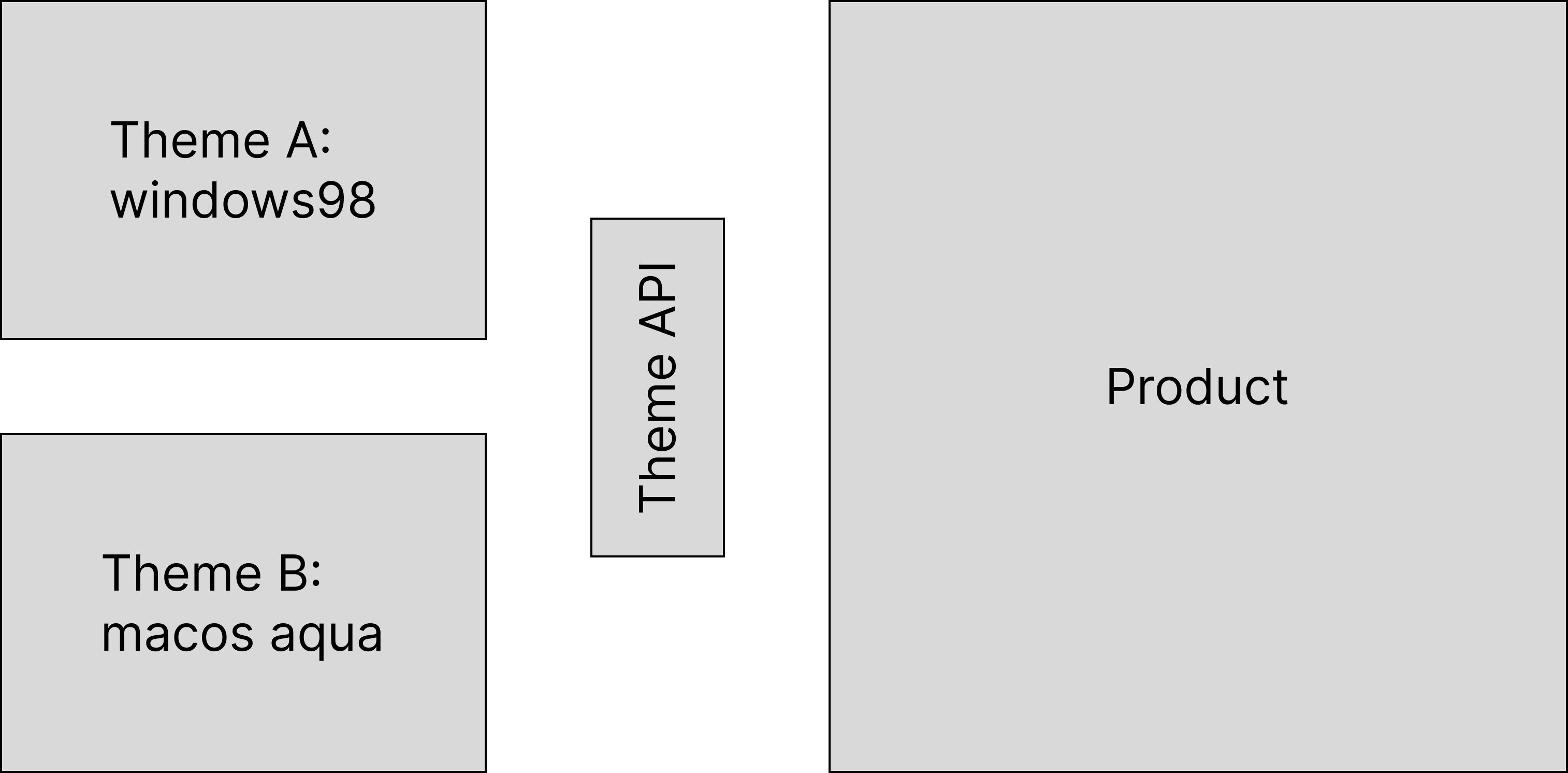
Themes contain the design decisions of your brand with differing capabilities (features and scopes) and are exchangeable within your product. A theme is a distributable asset.
A theme can be the "mac os aqua" or "windows 98" look and feel of your product as much as "version 1" and "version 2".

Workflow
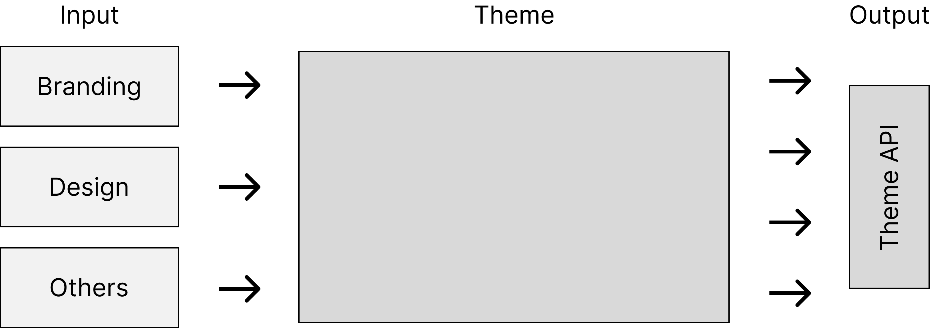
A theme is the playground and workshop for token designers to take the input from stakeholders, sprinkle in their secret spices, mix it up and produce output for token consumers.

For example the branding department provides colors and typography. Theme authors validate those inputs (eg. for accessibility) and if colors and typography can play well together and will propagate them to outputs.
Lukas Oppermann describes the concept of choices and decisions (2019) - where these inputs become the choices which a theme author connects to decisions (the output).
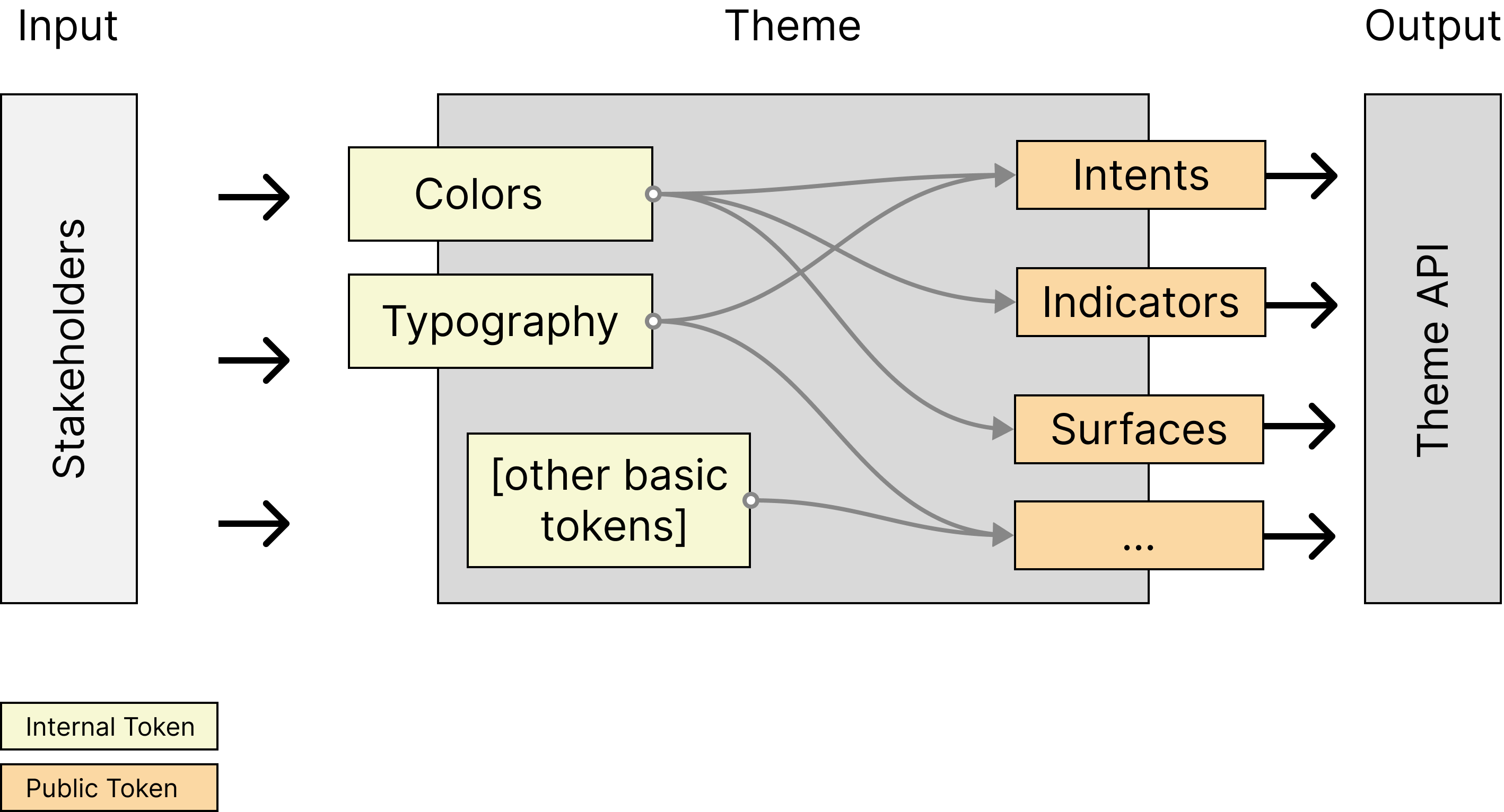
Visibility of design tokens is closely related. Tokens are internal and external to a theme. Token designers work with internal and external tokens, while token consumers are solely presented external tokens.
There is a high cohesion between internal tokens being choices and external tokens being decisions, yet the two are independent from each other; external choices and internal decisions are valid and exist.

Token Designers make use of references (or alias) as their most powerful mechanic to connect inputs to outputs.
Features
Themes can support features:
- Ambience features: color schemes, color contrast, color correction / chroma, skin
- Animation features: Motion
- Sizing features: Font Size, Density
Supported features with their behaviors is meta information about a theme. When a theme supports a feature, it also defines the default option and behavior for how to apply that feature. For example:
{
  "name": "ocean",
  "features": {
    "color-scheme": {
      "default": "light",
      "behavior": "adaptive"
    }
  }
}
While this information sounds trivial, it is tricky to understand correctly.
- Themes support color-scheme features
- Theme authors are able to support varying values for tokens
- When the theme is loaded into a product, the product knows which behavior to apply (based on meta information about the theme)
Defining token values is independent from the behavior in the final product. Regardless of the product behavior, when authoring we use a mode to design and test permutations of token values.
A feature is supported through tokens storing different values based on clear feature definitions, e.g.:
{
  "value": "darkgrey",
  "features" {
    "color-scheme": "dark"
  }
}
Instead of hardcoding values, references are the mechanic to assign the value. This allows building switches to control the final token value. The complexity increases the more features are supported for one token:

The token intent-action-base-background has permutations of values. Here is the formula:
token = contrast x scheme x chroma x skinIn the example:
- contrast has 3 options (high, low, none)
- scheme has 3 options (light, dark, none)
- chrome has 4 options (red-green, blue-yellow, monochrome, none)
- skin has 4 options (green, orange, violet, none)
Let's do the math:
intent-action-base-background = 3 * 3 * 4 * 4 = 144In total, the token intent-action-base-background can potentially contain 144 values!
Not every feature requires creating a switch for a token, which is visualized through the None path. These switches make sense for color type tokens. Typography, sizing, animation and other types each follow their own rules.
Theme API
We want token designers and consumers to work independently while agreeing on the exchange of information. A contract between both parties to make their work predictable and assure the promises of it. In programming this is called an "API" (Application Programmable Interface) and Matthew Ström (2019) had the idea for a Design API. While this idea is making design programmable and shares ideas for the technical parts, here is an addition for a Theme API.
Settings
A theme stores meta information, expressing which features a theme is offering with which behavior. Upon that, can contain more information relevant to a given theme.
Token designers, describe a theme with its supported features and permutations, to later provide different token values.
Following the idea from Ström, here are endpoints and possible return values.
GET https://example.com/api/:theme{
"name": "ocean",
"features": {
"color-scheme": {
"default": "light",
"options": ["light", "dark", "midnight"],
"behavior": "adaptive"
},
"color-contrast": {
"default": "low",
"options": ["low", "high"],
"behavior": "adaptive"
}
}
}As token consumers, this response will give us a couple of information: We know, the theme's name is ocean and the supported features are color-scheme and color-contrast. For color-scheme, three options are available: light, dark and. midnight. Both features shall be supported in an adaptive behavior.
Imagine being in a position to create a UI to change themes and after retrieving the information above constructing a UI to change the preferences for these features. It is straight forward but for midnight... that's a challenge.
Tokens
Tokens are the main citizen within a Theme API. To ensure independence of token designers and token consumers, while keeping the promises and guarantees off the contract intact, there needs to be an agreement of supported tokens. The Token API is a list of names. As features modify the value of a token, themes can support this on their own needs.
GET https://example.com/api/:theme/tokens[
"surface-base",
"surface-layer1",
"intent-action-base-background",
"intent-action-base-border",
"intent-action-base-text",
"..."
]When developing a theme/design system, this list is being worked on from both parties. Design system team to work out the visual design language and its necessary tokens and product teams send feature request for particular elements and how to style them, which inevitably results in tokens, components or extended usage guidelines for existing ones.
Equally interesting is the inner workings of a theme, how to support multiple features and keep the integrity of tokens intact. Let's define a plain token, request it per API and increase complexity while explaining.
Single Value
At first the intent-action-base-background token with a single value:
{
  "intent-action-base-background": {
    "$type": "color",
    "$value": "darkblue"
  }
}
and then requested via endpoint:
GET https://example.com/api/:theme/tokens/intent-action-base-background{
"intent-action-base-background": {
"$type": "color",
"$value": "darkblue"
}
}Multiple Values
As token designers, we can support this token with different features, beginning with color-scheme:
{
"intent-action-base-background": {
"$type": "color",
"$value": [
{
"value": "darkblue",
"features": {
"color-scheme": "light"
}
},
{
"value": "lightblue",
"features": {
"color-scheme": "dark"
}
}
]
}
}Which now can be requested while explicitly querying for a feature:
GET https://example.com/api/:theme/tokens/intent-action-base-background?color-scheme=dark{
"intent-action-base-background": {
"$type": "color",
"$value": "lightblue"
}
}Defaults as Fallback
While extending support for more features, the requests from earlier are kept intact:
GET https://example.com/api/:theme/tokens/intent-action-base-backgroundwithout querying any explicit features, theme defaults will be used: color-scheme: light and color-contrast: low will be the base and can be overridden by query parameters.
Allowing to extend support for color-contrast feature:
{
"intent-action-base-background": {
"$type": "color",
"$value": [
{
"value": "darkblue",
"features": {
"color-scheme": "light"
}
},
{
"value": "lightblue",
"features": {
"color-scheme": "dark"
}
},
{
"value": "paleblue",
"features": {
"color-scheme": "light",
"color-contrast": "high"
}
}
]
}
}Requesting:
GET https://example.com/api/:theme/tokens/intent-action-base-background?color-contrast=high{
"intent-action-base-background": {
"$type": "color",
"$value": "paleblue"
}
}The query requested color-contrast=high which was merged with color-scheme=light and responded an expectable value.
However, requesting:
GET https://example.com/api/:theme/tokens/intent-action-base-background?color-contrast=high&color-scheme=darkwould return an empty value, as this combination is not supported. This a valid response, that tools can prevent by validating combinations when designing tokens.
Scopes
Scopes (or Subthemes) are applied on selected areas within a product, for example special cards or hero sections. These selected areas receive a special treatment for inverted colors, or a dark-ish taint (even if the current color-scheme is light) to accentuate an element and make it stand out. Within that element, you want to keep continue using your tokens as learned, no namespacing, no prefix, no masking, no suffix, no nothing. Donnie D'Amato (2023) describes his idea as a solution to what he calls the ondark virus. Scopes do not have to describe all tokens, but the relevant tokens being used for these occurrences.
Both features and scopes provide more values for a token, yet there is an important difference. Scopes and tokens shape the surface of the API, wheres features don't. When keeping themes interchangeable, they need to support the same tokens and scopes, but themes might support different features.
In order to put scopes into the theme API, there are two adjustments to make. First to expose the available scopes in the settings and second to define values for a given scope.
Adding Scopes to Settings
Enhancing the existing settings with an option for scopes.
GET https://example.com/api/:theme{
"name": "ocean",
"features": {...},
"scopes": ["invert"]
}Now a consumer of the theme API is aware of a scope called invert and is able to apply that to a selected area.
Defining Values for Scopes
Much like defining multiple values for various features, the same mechanics can be used when defining scopes:
{
"intent-action-base-background": {
"$type": "color",
"$value": [
{
"value": "darkblue"
},
{
"value": "lightblue",
"scope": "invert"
}
]
}
}which can be requested with this query:
GET https://example.com/api/:theme/tokens/intent-action-base-background?scope=invert{
"intent-action-base-background": {
"$type": "color",
"$value": "lightblue"
}
}Assets
A theme consist of font files, icons, illustrations and other physical files. A theme API should have a way to provide this information for a consumer.
which can be requested with this query:
GET https://example.com/api/:theme/assets{
"assets": [
{
"$type": "font",
"$url": "https://example.com/assets/curly-braces.woff",
"$name": "Curly Braces",
"$format": "..."
},
{
"$type": "svg",
"$url": "https://example.com/assets/person.svg",
"..."
}
]
}The format of the response is a sample, but the important aspect are:
- There is a list of all assets available
- Each asset has metadata with its details
- An asset has a location to a physical file
The format of the API and its capabilities is up to the implementation and can vary depending on respective needs.
Using Themes
Your product uses a theme - implicit or explicit. When explicit they are likely exchangeable. As themes define their supported feature set changing them can result in different behavior for the final product. This is welcoming to users, when switching from v1 to v2 theme and the second version is supporting a new feature. A product may even offer switching themes to customers.
Formalizing a Theme API
Putting this into formal/specification-like language:
- A theme API is a contract between a product (token consumers) and a theme (token designers)
- A contract is described through a signature listing the mandatory and optional capabilities
- List of tokens and scopes is mandatory
- Features are optional
- A theme describes its features with its behaviors
- A theme is exchangeable, when it complies with the signature of the theme API
Tokens are currently defined in the Design Tokens Format Module by the W3C Design Tokens Community Group. Design tokens need an addendum to support multiple values, which is at the time of writing being discussed in Native modes and theming support.
1. Define the Capabilities of a Theme
A theme at first must mention its capabilities in terms of features and scopes, using typescript to describe the format:
interface Theme {
name: string;
features?: Features;
scopes?: string[];
}
interface Features {
[feature: string]: {
default: string; // must be available in options
options: string[];
}
}And an example:
{
"name": "ocean",
"features": {
"color-scheme": {
"default": "light",
"options": ["light", "dark", "midnight"]
},
"color-contrast": {
"default": "low",
"options": ["low", "high"]
}
},
"scopes": ["invert"]
}2. Multiple Token Values
Danny Banks (2021) shows two approaches using multiple token values with Style Dictionary, either using multiple files or a token with multiple values.
Given token designers work on text files to define tokens, it is a question of flavor which approach they choose, and for what reason. For example, using one file per feature (to work on one color-scheme) or files per bounded context (eg. intents) but seeing multiple values at once. Here are both approaches explained:
{
  "intent-action-base-background": {
    "$type": "color",
    "$value": "darkblue"
  }
}... and another file for dark color scheme feature:
{
  "intent-action-base-background": {
    "$type": "color",
    "$value": {
      "value": "lightblue",
      "features": {
        "color-scheme": "dark"
      }
    }
  }
}
The $value definition gets more detailed by describing the constraints under which this value is valid.
All this is working with scopes being present:
{
  "intent-action-base-background": {
    "$type": "color",
    "$value": {
      "value": "lightblue",
      "scope": "invert"
    }
  }
}
The same token defined three times, in three different files. They can be compiled into one file:
{
  "intent-action-base-background": {
    "$type": "color",
    "$value": [
      {
        "value": "darkblue"
      },
      {
        "value": "lightblue",
        "features": {
          "color-scheme": "dark"
        }
      },
      {
        "value": "lightblue",
        "scope": "invert"
      }
    ]
  }
}
When all files above are merged, the compiled one is the output or serves as format when editing with all constraints at the same time.
As a formalized definition, using typescript again:
/*
this is the way how a current value can be defined, depending on its type, etc.
As this is not relevant here, I assigned it to a string - but give it a name to
make the connection to the work that was already put into here
*/
type CurrentValue = string;

interface ConstrainedValue {
  value: CurrentValue;
  scope?: string; // must be the values defined in meta file
  [feature: string]: string; // must be the values defined in meta file
}

type SingleValue =
  | CurrentValue
  | ConstrainedValue;

type Value =
  | SingleValue
  | SingleValue[];
INFO
These types are supported by @theemo/tokens
At the time of writing this article, this is currently being discussed at the DTCG group, in order to add this to the spec. This idea is placed there amongst those from other contributors.
References
- Banks, D. (2021, April 29). Dark Mode with Style Dictionary [blog post]. Retrieved from https://dbanks.design/blog/dark-mode-with-style-dictionary
- D’Amato, D. (2023, January 12). Ondark virus. https://blog.damato.design/posts/ondark-virus
- Oppermann, L. (2019, Jan 19). Design tokens — What are they & how will they help you? [blog post]. Retrieved from https://lukasoppermann.medium.com/design-tokens-what-are-they-how-will-they-help-you-b73f80f602ab
- Ström, M. (2019, Nov 20). Design APIs: the evolution of design systems_. Retrieved from https://matthewstrom.com/writing/design-apis